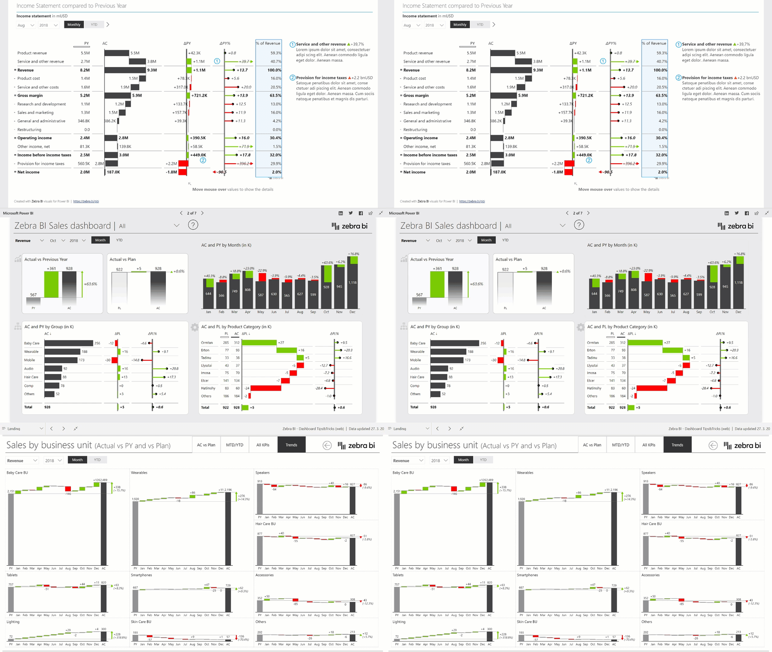
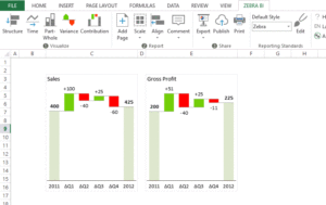
Meaningful reports created easily! Create stunning reports and dashboards with powerful visualizations for Microsoft Excel and Microsoft Power BI
Zebra BI is an advanced data visualization and reporting tool for Excel and Power BI. With Zebra BI, users can create IBCS-compliant dashboards, reports, and presentations with just a few clicks.
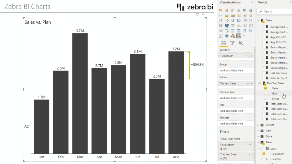
Zebra BI offers Custom Visuals (CV) for Power BI. One CV is available for tables and one for charts, the latter of which supports time series, lines, or waterfall charts. Both visuals offer the possibility to display deviations in a simple way, both in absolute and percentage terms. The CV support all the functions of Power BI and are fully interactive. Zebra BI CVs take into account the SUCCESS rules of Prof. Hichert and thus comply with the IBCS standard.
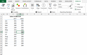
With Zebra BI, you can create an IBCS-compliant chart and reporting directly in Excel with just a few clicks. The Zebra BI Excel add-in offers the common IBCS graphic types such as time series, structure, or waterfall charts. Simply select the data range, select graphic type and the IBCS-compliant chart is ready. Many additional functions are helpful, such as adapting the graphic to predefined cell ranges, scaling several graphics at the same time, and commenting functions.
Make sure your reports are consistent no matter who designs them.
Even if thousands of employees in your organization interact with Power BI or Excel-based reports, you can now ensure that every single report and dashboard page has a consistent design, making it easier to understand.
Learn more about our IBCS compliance and custom themes
Zebra BI is your entry into self-service BI. Let Zebra BI Visuals calculate and visualize your most important business factors for you!
With ready-to-use YoY growth rates, deviations from plan, PY or forecast, etc. Zebra BI will simplify your data models and dramatically shorten your report development cycles. The result? Fast and flexible reports that are easy to maintain in the long run.
Make your annual reports and dashboards understandable and meaningful.
With Zebra BI visualizations, you not only show how good or bad something is, but you can tell exactly what’s going on.
Zebra BI supports Dr. Rolf Hichert’s International Business Communication Standards (IBCS) and therefore corresponds 100% to the highest quality standards in business reporting.
Zebra BI visualizations are certifiedbyMicrosoft, which guarantees that they meet strict security standards and follow Microsoft’s best practices.
Enhance your Microsoft Power BI reporting with the state-of-the-art, powerful, and intuitive Zebra BI visualizations for Power BI. These top features of Zebra BI Charts and Tables will help you save time, money and effort:
Chart Slider
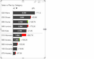
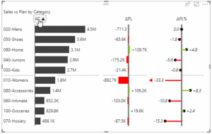
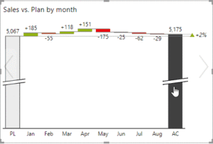
The Zebra BI Charts Visual has a “Chart Slider”. To use it, simply hover over the visual and you will see two arrows (< and >) on the left and right sides of the chart. Click on these and see how your data is visualized with another advanced business chart.
Hierarchical tables
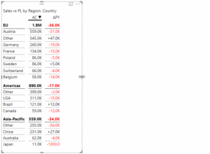
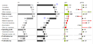
Advanced hierarchical tables automatically calculate absolute and relative deviations and adjust the display of all elements to the available space.
You can add an unlimited number of layers and display exactly the ones you want. These hierarchical tables are ideal for visualizing profit and loss reports (income statements).
Responsive Layout
Zebra BI visualizations for Power BI are the world’s first fully responsive BI visualizations. The visuals automatically adapt to the displayed content and the available space.
Small multipliers!
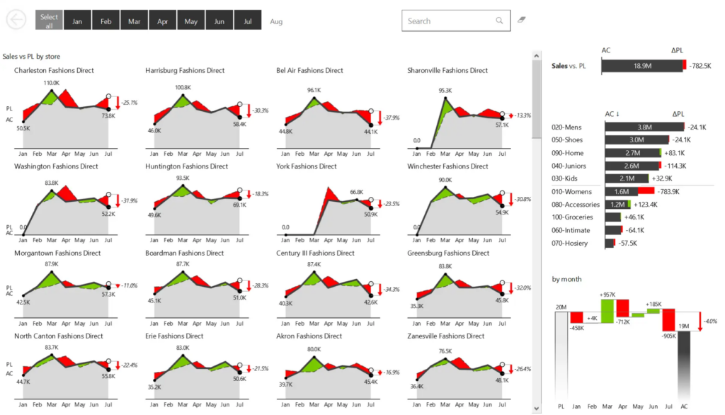
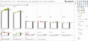
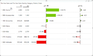
If you add another dimension to your existing chart (called “grouping” in Power BI), you’ll get the multiples of the chart you choose. All charts are automatically rendered at the same scale (automatically synchronized Y-axis). This allows end users to compare multiple categories of data on the same page.
Sort with one click
In the visualization of Zebra BI tables, a click on the column heading is enough to sort by the respective key figure displayed in the column. If you do this in a hierarchical table, a multi-level sorting is automatically applied (across several levels at the same time)!
Axis break in waterfall diagrams
Although the “axis break” is a controversial Dataviz method, it can help to show the contribution of data elements to the overall result more clearly.
Expand/collapse rows and columns
In hierarchical tables, you can expand/collapse rows and columns by simply clicking the arrows. You can also choose to reduce or expand everything, which allows you to customize your tables exactly to your needs and desires.
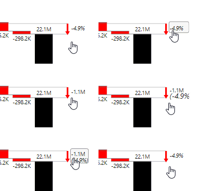
Change of deviation calculations with a click
You can change the calculation of deviations and difference highlighting by clicking directly on the labels.
Income statements (P&L) in Power BI!
With Zebra BI’s vertical waterfall charts and deviation charts, you can P&L and display and analyze price calculations simply and clearly.
With subtotals, invertible rows for costs and automatically calculated absolute and relative deviations (e.B. to the previous year, to the plan or both)…
Native support for IBCS®
Zebra BI Visuals are fully compliant with IBCS (International Business Communication Standards).
The IBCS standard design notation is rendered automatically without the need to make any settings!
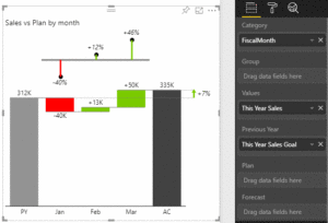
The typical business scenarios such as actual (AC), plan or budget (PL, BU), forecast (FC) or previous year (PY) are automatically coded with standard patterns. The deviations are represented in intuitive plus-minus, lollipop or waterfall charts. Even the smallest details such as difference highlighting, outlier indicators, semantic axes, etc. are displayed automatically and pixel-perfectly.
Waterfall charts with subtotals
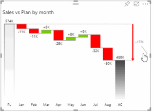
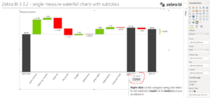
Zebra BI Charts visual supports new waterfall charts with extremely flexible subtotals.
This type of waterfall chart can be easily created with just a metric and a category data field. To represent an element on the chart axis as a subtotal, simply right-click the element name and select Result from the menu. Similarly, you can invert a selected item if it represents a “bad” metric (e.B cost/expense) that reduces the bottom line.
Segmented charts
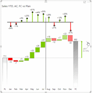
Segmented charts allow multiple comparison points in the same chart, which is particularly suitable for displaying forecasts.
A typical example of this is the comparison of actual values (AC) and forecasts/estimates (FC) with the plan/budget (PL) in the same diagram.
Expand Excel with missing charts
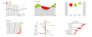
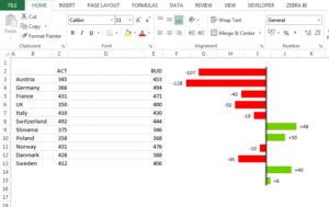
Deviation diagrams, Waterfalls, Hills & Valleys, Lollipops and much more. All the business charts you need for professional reporting.
Simply insert the Zebra I diagrams
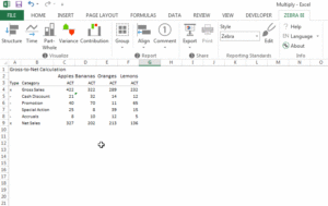
Just click anywhere in your Excel data table and select a business chart. Just like you would insert a normal Excel chart.
You can create charts from Excel values and formulas, pivot tables, PowerPivot, or third-party add-ins such as SAP BO Analysis for Office, XLCubed, and so on.
Increase the density of information.
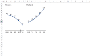
Small multiples of charts are one of the most effective methods of data visualization. However, it is extremely time-consuming to create such reports manually. You need to create multiple charts, align them, bring them to the same scale, and manipulate the category labels. Zebra BI generates multiples with two clicks.
Embed charts in tables.
With Snap move, you can embed charts in tables with a single click and have them aligned automatically.
This allows you to create combined table-chart reports with the accuracy of a table and the clarity of a chart. Many best practices in corporate communications use this combined approach.
Visual storytelling at its best
Highlight categories, show differences and CAGRs, add comments and visual explanations.
Visual storytelling has never been so easy!
Scaling for correct visual comparisons.
Scaling correctly is one of the most difficult problems with data visualization.
With Zebra BI, you can synchronize the scaling of any number of charts. Even across different chart types.
With the areto Business Intelligence experts to the data driven company!
Find out where your company currently stands on the way to becoming a data-driven company.
We analyze the status quo and show you what potential exists.
How do you want to get started?
Free consulting & demo appointments
Do you already have a strategy for your future reporting solution? Do you already use the advantages of modern visualizations? We would be happy to show you examples of how our customers are already using dashboard and reporting solutions.
Workshops / Coachings
Our reporting workshops and coaching sessions provide you with the know-how you need to build a modern information strategy. The areto Data Analytics TrainingCenter offers a wide range of learning content.
Proof of Concepts
Daniel Olsberg
Director Business Development
Phone: +49 221 66 95 75-0
E-mail: Daniel.Olsberg@areto.de